


Cubic-bezier timing-functions are an incredibely helpful tool to create perfectly smooth animations and transitions, but the meaning of its parameters isn't directly obvious.
Have you ever copy/pasted a cubic-bezier curve because you liked an animation or transition, without fully understanding what these numbers are about?
This guide will walk you through the entire concept step by step to help you master the fundamentals - and transition from zero to cubic-bezier hero with ease 🤟
Why cubic-bezier functions are so powerful
With a cubic-bezier curve, it is possible to define the whole animation with just one timing-function and one keyframe/final state - super convenient compared to writing out a whole set of keyframes!
What we'll explore in this article:
- how the parameters shape the curve
- how to tell what the animation will look like from a glance at the curve
- the parameters of the built-in CSS timing-functions
- how to create exactly the animation you want by defining your own custom cubic-bezier curves
What is a cubic-bezier curve?
And do I need math to understand this?
You won't need a lot of math to understand cubic-bezier curves, if any at all, just a bit of imagination (being familiar with paths in vector graphics would help a lot, too).
Drawing paths in vector graphics means drawing bezier curves. Looking at the diagram above, a cubic-bezier path has a start point and an end point (grey), and both points each have an optional "handle" to shape/bend the curve (red/blue).
It's quite intuitive how those handles shape the curve. Think of them as magnets that bend the curve towards them. The longer the handle, the stronger is the magnetic force. With two handles both bending one curve, they're also competing with each other.
At the start point, the curve is entirely under the influence of the red handle. This influence decreases as we move along the curve, while the influence of the blue handle increases until it takes over. When exactly it takes over depends on both handles' lengths.
If this is completely new to you, I recommend that you take a minute to visit this tool to create, modify and compare cubic-bezier curves. You can play with both handles and watch how their positions influence the curve's shape.
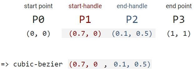
Cubic-bezier curves are defined by four points:
P0: the start pointP1: the start point handle (can be identical toP0)P2: the end point handle (can be identical toP3)P3: the end point
(Further reading: For a visual explanation of how the curve is constructed from those four points, visit the MDN docs )
The cubic-bezier parameters in CSS
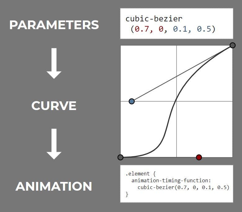
In a CSS cubic-bezier curve, the start and end point are fixed at positions (0,0) and (1,1). We can only modify the positions/coordinates of their handles. Those coordinates are our cubic-bezier parameters:
Because start and end point are always the same, we only need to define the coordinates of the handles to define the whole curve.
A handle's coordinates can be identical with the start or end point coordinates - which only means that there is no handle to bend the curve.
- the curve always goes through the start point
P0and the end pointP3, but not necessarily through the handles' positionsP1andP2 - a common case where the curve does go through
P1orP2is when the start or end point have no handle at all
What exactly are those parameters/coordinates?
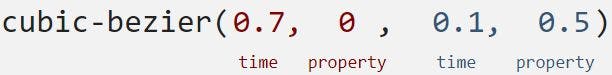
A cubic-bezier timing-function describes the change of something over a period of time, so the coordinates of our handles are (time, something) pairs.
Something in the context of CSS timing-functions is always a CSS property that can be animated - that's a property that can be denoted with a numerical value, like:
- width, height
- top, bottom, left, right
- transform
- color
- opacity
- font-size
- ... and many more
(See the MDN docs for a full list of all animatable properties)
The cubic-bezier parameters denote the
(time, property) coordinates of the two handles that shape the curve:
What are "relative" coordinates?
The (time, property) pairs are written in relative coordinates: every animation starts at (time=0, property=0) and ends at (time=1, property=1) (in other words, both time and property move from 0% to 100%).
Let's say we're animating the width of an element, starting with width = 0 and ending with width = 300px.
Translating those values to relative coordinates only means setting them relative to the final state:
- from:
0 / 300px = 0 - to:
300px / 300px = 1
This means that we don't have to worry about which absolute values we define for our animations or which units they have (from width:0px to width:300px, from height:80% to height:10%, from font-size:1em to font-size:3em, etc...). The start point and the end point are always fixed at (0, 0) and (1, 1).
Translating the curve to motion
How to read a cubic-bezier curve
Every animation has an initial state and a final state, as defined by our start and end points at P0 = (0, 0) and P3 = (1, 1). But there's a thousand ways how an element could transition in between. It could start moving very slowly, accelerate, and come to a sudden end. It could start moving abruptly with high speed, and continously decelerate until it stops.
The manner in which the transition happens is described by the timing-function - the bezier curve - and we can easily read from the curve how the animation will turn out.
All we have to look for is the slope of the curve. A shallow slope means slow change. A steep slope means rapid change.
Let's look at the curve from above again, and let's imagine we're animating the height of an element.
- we start at
(0, 0)and walk with constant speed along the time-axis - after
t = 0.2(after 20% of the total animation time has passed), we can see only very little change in height - from
t = 0.2untilt = 0.5, the height changes quickly to about50%of its final value - for the second half of the animation, the movement slows down until it suddenly stops
With this knowledge, we already have everything we need in order to tell what an animation will look like, just by looking at the curve. However, I'd still like to spend some more words on the start and end point (and the position of their handles), because those heavily influence the look-and-feel of your animation.
Why is the start point of the timing-function so important?
If we take a look at the two cubic-bezier curves below, they seem quite similar. The (big) difference lies in how the curve "leaves" the start point, which has massive impact on the character of the animation.
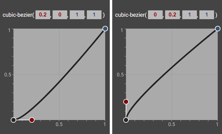
In the left diagram, the red (start point) handle lies horizontally.
- the
timecoordinate is greater than0 - the
propertycoordinate is0
In plain english, this means that in the beginning of the animation, the time will move forward, while the property value doesn't change. The animation starts smoothly. Something has an initial speed of zero, and slowly gets into motion - like a ball on a ramp that starts rolling downwards.
In the right side diagram, things are reversed. The start point handle has vertical orientation, because:
- the
timecoordinate is0 - the
propertycoordinate is greater than0
When the time is 0 and the animation begins, the element already has an initial speed. Instead of a slow, smooth start, this animation starts abruptly - imagine a ball being kicked, or bouncing back from the floor.
Note that the only case where the animation starts with a speed of 0 is when the handle lies horizontally. In every other case, it starts with a speed greater than 0. A vertical handle is the extreme case of maximum initial speed.
In many cases, a slow and smooth start is preferred, because it is more pleasing to the eye, but it ultimately depends on what we're trying to convey with our animation.
What about the end point of an animation?
Everything we said above about the start point handle applies to the end point handle as well. A horizontal handle means that the movement gradually slows down until its speed becomes 0. Every other orientation of the end point handle results in a sudden stop of motion.
- curves that start/end with a shallow slope make an animation start/end slowly and smoothly
- curves that start/end with a steep slope make an animation start/end suddenly and abruptly
The predefined CSS cubic-bezier curves
Your toolkit for the most common kinds of movement
By now, we should be able to define a cubic-bezier curve for any animation we might have in mind, but choosing the right parameters and typing them out is often not even necessary. CSS has a number of in-built timing functions that are easily accessible through a keyword. These are (with their corresponding parameters):
- linear:
cubic-bezier(0, 0, 1, 1) - ease-in:
cubic-bezier(0.42, 0, 1, 1) - ease-out:
cubic-bezier(0, 0, 0.58, 1) - ease-in-out:
cubic-bezier(0.42, 0, 0.58, 1) - ease:
cubic-bezier(0.25, 0.1, 0.25, 1)
(Note that if we don't explicitly define a timing-function, the default value ease will be applied to the animation.)
Can you tell just from the parameters how the animation will look like? If that seems difficult, you can grab a piece of paper and try to draw a rough sketch of the curve (or use the cubic-bezier online tool I linked above).
You can also find a visualisation for each of the curves in this codepen.
(On a sidenote: The parameters of the built-in timing functions aren't random at all, they're not the result of someone trying out different curves and just arbitrarily picking a set of parameters that look good - but this is beyond the scope of this article. If you're interested in the origin of these curves, you can read more in this article: realistic animations with CSS timing-functions - bouncing balls, pendulums and tossing books)
More complex animations: Changing direction
Pushing beyond the boundaries of the box
The power of cubic-bezier timing functions doesn't end here.
So far, we've only set our parameters between the range of 0 and 1. But it's actually possible to go beyond that and make some more complicated animations.
The time coordinates of the handles are restricted to values between 0 and 1, but the property parameter has no limitations, it can have values from -infinity to infinity, if that still results in a valid CSS value for that property.
Properties like top, left or transform:scale(value) don't have any restrictions, they can even be negative, while others like opacity or width are only valid within a certain range, or only valid as long as they're >0. If the timing function tries to set a CSS property to an invalid value, it will be clipped (an opacity value of 1.5 will be interpreted as opacity: 1; by the browser).
Example: Cartoon ball
Let's say I'm trying to create an animation that resembles some cartoon-like movement, where an element first moves backwards a bit, then dashes over to the right, where it "bounces back" before it stops. I'll need some really long handles to bend the curve that far:
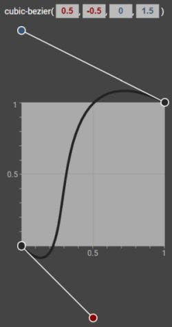
Dragging the curve "out of the box" means that my curve now goes through a minimum and a maximum (roughly at (0.15, -0.1) and (0.7, 1.1)).
At these points, the property that I'm animating (in this case it's the left property) changes direction.
- before the minimum, the element is moving to the left
- after the minimum, it's moving to the right until it hits the maximum
- after the maximum, it's moving to the left again
To make sure that my element doesn't dash out of the boundaries of my page, I'll give the left property a start value above 0% and an end value below 100%.
I'll also only let the animation run between the 20% and 70% keyframes, to have the element stand still for a while at the start and the end.
Let's see how that looks like:
This is a fairly complex animation with changes in both speed and direction - and with very little code, thanks to cubic-bezier curves:
.ball {
  animation: cartoon-ball 2.5s infinite;
}

@keyframes cartoon-ball {
  0%  {left: 10%}
  20% {left: 10%; animation-timing-function: cubic-bezier(0.5, -0.5, 0, 1.5)}
  70% {left: 80%}
  100%{left: 80%}
}
Summary
- a cubic-bezier curve describes in which manner an animatable CSS property transitions from the initial to its final state
- the steeper the curve, the faster the property changes
- the shape of the curve is defined entirely by the positions of the two handles that bend the curve towards them
- the coordinates of these handles are
(time, property)pairs, and form the four cubic-bezier parameters - the orientation of the handles (from horizontal to vertical) - and therefore the slope of the curve in the start and end point - has massive impact on the character of the animation
- CSS offers a number of built-in curves, accessible by a keyword
- setting the property coordinates outside of the
(0, 1)range gives the curve a minimum/maximum/both, which introduces a change in direction into the animation
Thank you for reading!
Please leave any comments or feedback below, or @ me on Twitter. If you liked this post, I invite you to subsribe to my newsletter. Until next time 👋